Snowflake Use
Optional for customers who use Snowflake
Introduction
The Snowflake Performance Dashboard presents a number of visualisations by aggregating data from various table within the SNOWFLAKE database. These visualisations provide a breakdown of activity within your warehouse so you are able to target your optimisation efforts effectively. The majority of Snowflake costs are driven by the period of time the warehouse is 'active'. You can read more about Snowflake billing here
Setup
Granting permissions in Snowflake
By default only the ACCOUNTADMIN user within Snowflake has access to all the relevant tables within the SNOWFLAKE database. So you will need to log in as the ACCOUNTADMIN and grant usage permissions to the relevant user. For details of how to grant privileges in Snowflake please read their documentation.
If you do not have access to the ACCOUNTADMIN Snowflake user because Kleene supports your warehouse then please contact your customer success manager to do this for you.
You can either grant permissions on the whole SNOWFLAKE database as shown in the example below:
GRANT IMPORTED PRIVILEGES ON ALL TABLES IN DATABASE SNOWFLAKE TO ROLE ELT;
GRANT IMPORTED PRIVILEGES ON ALL VIEWS IN DATABASE SNOWFLAKE TO ROLE ELT;
If you do not want to grant the privileges on the entire SNOWFLAKE database here are the tables and views that the user needs SELECT privileges on:
ACCOUNT_USAGE.DATABASE_STORAGE_USAGE_HISTORY
ACCOUNT_USAGE.QUERY_HISTORY
ACCOUNT_USAGE.WAREHOUSE_EVENTS_HISTORY
Enabling within the Kleene app
Once you have the appropriate permissions granted on the relevant role within Snowflake please contact your customer success manager who will enable the dashboard within the Kleene app for you.
Filtering
At the top of all sheets within the Snowflake Performance dashboard are a set of filters that will filter the visualisations. The filter chosen on one sheet will be persisted and displayed on all other sheets.
Key Visualisations
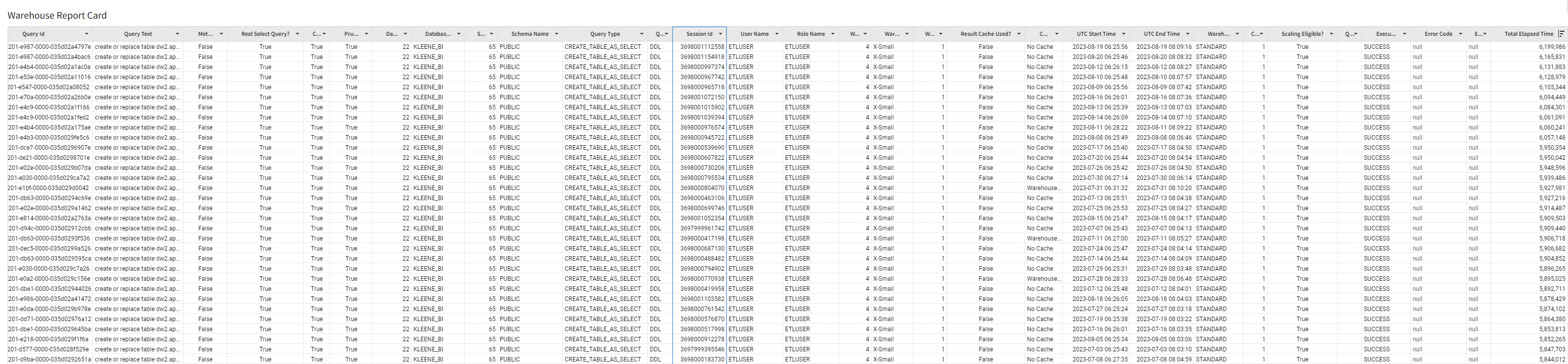
Summary - Warehouse Report Card
This table shows every query that is executed in the warehouse. As in the example below it can be sorted by Total Elapsed Time, this will show you which queries are the longest running in your warehouse. Optimising the longest running queries in your transformations will have the most significant impact on reducing warehouse activity.
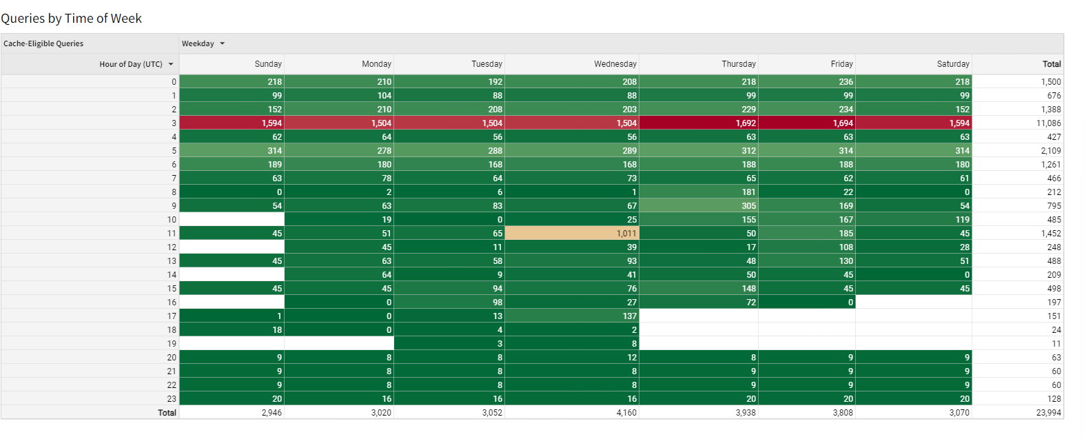
Warehouse Activity - Queries by Time of Week
This heatmap shows the days of the week in the columns and the hours of the day in the rows, the values in the cells are the number of queries executed. This visualisation should act as a check that queries are only being executed during the hours you would expect. Bunching the schedule of queries into a shorter timeframe will help reduce the total time the warehouse is 'active'.
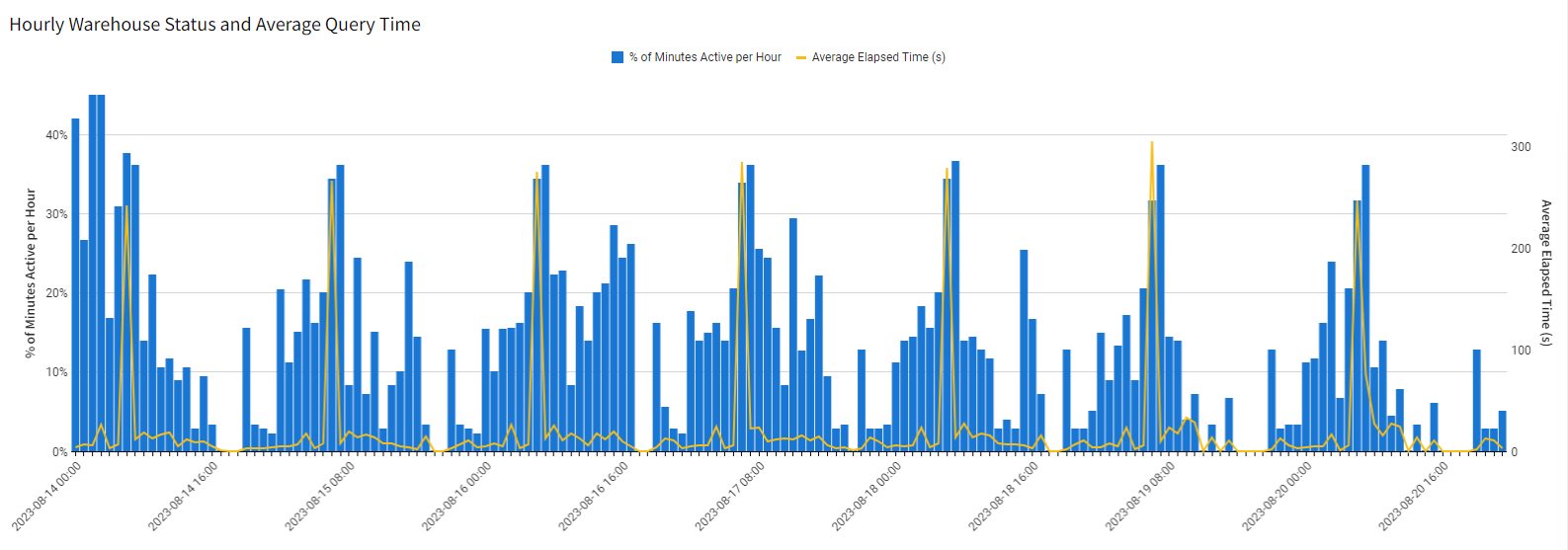
Warehouse Activity - Hourly Warehouse Status and Average Query Time
This combination chart shows the proportion of minutes in the hour the warehouse is active (blue bars) and the average elapsed time of queries (yellow line) by hour across the selected time frame (the default is one week). This visualisation should help trade off between minimising activity time (to reduce compute costs) and maximising execution speeds (by reducing not running multiple compute-intensive queries simultaneously).